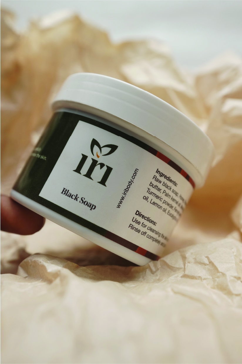
As a new cosmetic brand attempting to break into the Nigerian market, Iri needed to stand out in every way possible. Here's a breakdown of the entire branding process from scratch.

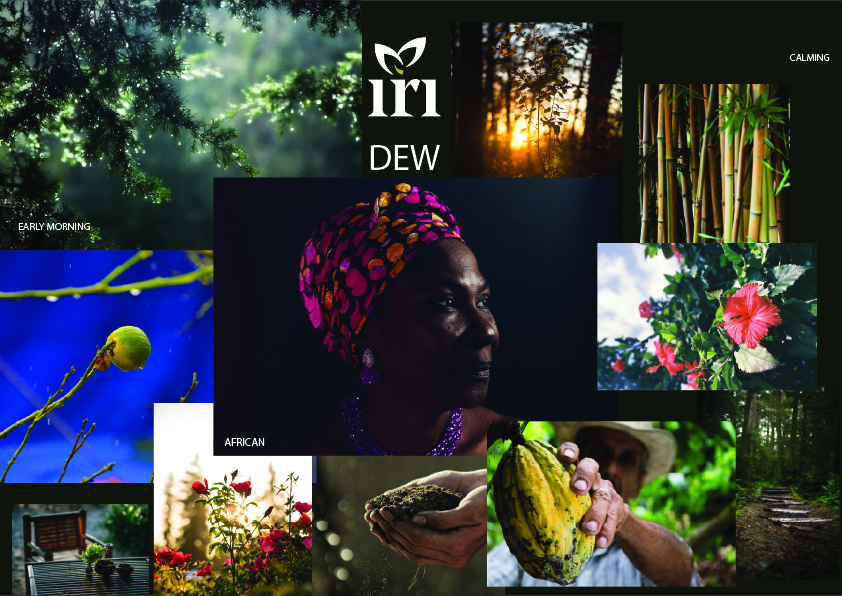
"It leaves my skin soft" is a common feedback from customers on the brand's products. This informed the name Iri which translates to Dew. From here, the entire brand personality was built. Instead of going with a soft dewy look, we decided to go bold instead; as bold as the forest that dew gives life to.
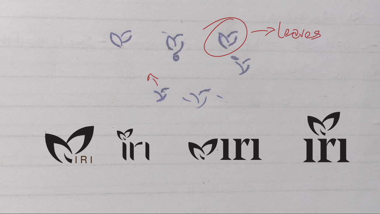
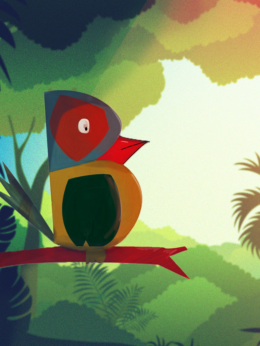
We needed a font that said "strong but still soft". The sharp edges and soft curves remind one of the unpredictability of trees. The flat bottoms also point to the stable nature of said trees. Dependable and alive. A few customisations later, we ended up with the final logo.
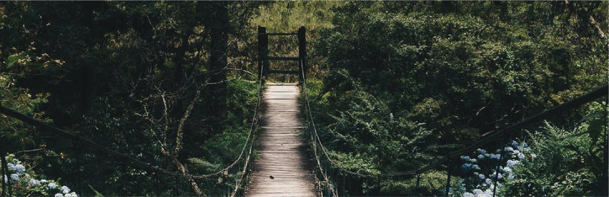
Most of the ingredients for the brand are locally sourced from tropical Western Nigeria, a land rich in foliage and earth. This directed the mood board style.
A jumble of images. A million things happening at once but in perfect harmony.


CREDIT:
Client: Iri Body
Agency: Extu Designs
Creative director: Tolulope Oladimeji
Art director: Oyindamola 'waleola Ogundare
Photography assistant: Ayodeji Ayoola

Leave me a message and I'll be sure to get back to you.